Reviewer Rachel Jagareski Interviews Sean Adams, Author of How Design Makes Us Think: And Feel and Do Things

We mere mortals are often mesmerized by the complexity of the world around us, so much of which we don’t understand. And we also reserve that feeling of awe for the brilliant artists, athletes, scientists, and designers walking among us like gods—their skills beyond our comprehension; but boy, do we appreciate the things they do.

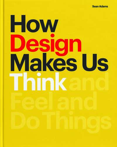
This week, we’re fortunate to spend time with one of the world’s top designers, Sean Adams. His recently released How Design Makes Us Think: And Feel and Do Things earned a glowing review by Rachel Jagareski in our March/April issue, so we jumped at the chance to get the two chatting about what makes great design. Thanks to Princeton Architectural Press for help with the connection.
You write that “every element in successful design works together to tell us how to think and, typically, what to do.” In general, do you think that we are surrounded by successful designs or mediocre ones? Do awful designs and fonts annoy you as much as typos and grammatical errors on signage or in texts bore into the brains of writers?
The words “successful design” are a landmine I was willing to step on. Some will demand I answer what makes something successful? Others ask who has the right to determine if it is successful or not? Since it’s my book, I decided what was successful for me: purposeful work that communicates a message and is aesthetically exciting.
I’m lucky that I spend most of my day surrounded by successful work at ArtCenter and having access to work from some of the best designers in the world. But, a quick look at a Pinterest site of “cool design,” or a drive down the street past the local mini-mall signage and mess of posted bills on walls is telling. Ninety-five percent of the design we see daily is acceptable and expected at best. Great design is rare. Otherwise, it would be ordinary.
Your book is organized with themes of emotions and messages that designers seek to convey, ranging the gamut from nostalgia and innocence to anger and seduction. It is an intriguing blend of art and science. How much research in behavioral psychology and cognitive science did you undertake for this book?
I was excited to write the book as an opportunity to do deep research into behavioral psychology, cognitive science, and evolutionary behavioral systems. I thought I had a good base knowledge about design and response, but I learned so much more with the research.
Something as simple as why primary colors (red, blue, and yellow) are appealing because they are easy to identify, therefore eliminating the stress of decision making. Complex colors like olive green ask us to decide if it is green, grey, yellow, or a mix of all. Decisions create stress, although we may not be aware of this consciously. Or, why a visual pun elicits humor. There were so many insights I found that made me see design much more clearly.
There is an impressive number of design examples from various historical eras and designers from around the world. Who/what are some of your favorite design inspirations when you are contemplating a new project?
One of my favorite challenges in writing a book is to identify examples with a wide range of historical eras, media, type of design (graphic, industrial, transportation, motion, etc.), and designers worldwide. I’m a complete history geek. If I were to have chosen another path, I would have been a historian. I know so many amazing designers and contemporary work, but looking through my design album in Mac Photo clarifies that I’m obsessed with work from pre-1990.
I’d love to claim that I am inspired by only the most erudite design, such as Herbert Bayer’s Universal typeface or a Cipe Pineles cover for Seventeen magazine. But, I have a special love for more plebeian examples such as the Princess telephone, Jack in the Box fast-food signage, and Roy Kuhlman’s cover for the paperback of Hiroshima Mon Amour.
The chapter discussing the use of humor in design was so much fun. The visual examples like the vegetable-themed condom packaging and pirate supplies for 826 Valencia (Peg Leg Oil!) were hilarious to view, but I also appreciated the insights into how humor connects people to products and messages. I notice many humorous aspects in your own designs shown in the book. Do you consider the insertion of humor as an essential tool in your design kit?
I know! I love those projects. I need the Peg Leg Oil. When I first started speaking at different conferences (long, long, long ago), a seasoned and well-known designer pulled me aside and said, “Stop being funny. Nobody will take you seriously.” Even if I wanted to do that, I couldn’t. I’m just not that dour in daily life.
Design is a serious business with an enormous impact on the economy and culture, but it doesn’t need to be without levity. The audience expects to be entertained. Humor, for me, is a way to present an idea with a softer touch. The message can include multiple layers of meaning and information, but opening with humor lessens the resistance. I start projects with the intent to be a “serious” designer. As hard as I try, however, I seem to end up back at funny. When I designed a system for a series of lecture posters recently, I worked with a beautiful and mathematically precise grid structure based on the golden section. But, I couldn’t stop myself from substituting the actual headshots of speakers with images such as a ventriloquist and dummy, a dancing poodle, and other less savory examples.
Graphic design, as with so many other design disciplines, goes through style cycles. Do you think it is vital to balance being in step with the current style and having a particular timeless design?
This is such a great question. The solutions we classify as timeless are often clearly connected to a specific time. A Marianne Brandt lamp from the Bauhaus is elegant, flawless, and classic. But it has an inherent relationship to the Bauhaus and 1920s. Avram Finkelstein’s poster, Silence=Death, is hugely successful and embedded in the AIDS crisis in the 1980s. Thirty years ago, I decided to stop trying to design work that was “cool.” I’m the last thing from groovy, so why try? I found it enormously liberating to not see the trendiest typeface, color palette, or form. I could focus on solutions that I believed were the best rather than worrying about the hipness quotient.
I often tell students that desperation in design, trying to be amazingly cool and “with it,” is like desperation in dating, not a good look.
Which of your designs are you proudest of and why?
It sounds so awful to say, “why yes, I am amazing.”
But I loved rebranding Nickelodeon. We reshaped the landscape of children’s entertainment from the chaos of purple and green colliding patterns to a simple Modernist approach focused on communicating to the audience with respect and ideas. The project succeeded in being a part of increased ratings and revenue, keeping many people employed with the entire brand. It’s significant (and makes me feel ancient) when I meet a young designer who tells me, “You designed my childhood.”
Sundance was another client that I worked with for years. Collaborating with the brand’s creative director, Samantha Fleming and Robert Redford, led to some of my favorite solutions. I was challenged, often frustrated, and pushed to do better on every project. The brand’s commitment to creativity and the environment was constantly exciting. How bad can one claim life is when you need to have meetings at the Sundance Resort in Utah with Robert Redford.
Rachel Jagareski
