Full Contact Warfare
Young Mans Fate
While the self-publishing industry has created opportunities for aspiring writers to share their creative visions with the world some works simply do not belong in the public arena. This book is an example of not-ready-for-prime-time talent.
It is hard to tell whether this book is meant to be a graphic novel a screenplay or a live role-playing game. It has pictures like a graphic novel text like a screenplay and the characters have attributes similar to what one might find in a live role playing game. But it is clearly none of the above. Various drawings and maps including a lightly printed one on the opening spread suggest that Full Contact Warfare may have been inspired by a game.
There is very little descriptive text here but a fair amount of dialogue. In some places it is difficult to follow the plot partly because of a lack of internal consistency. For example even though the setting appears to be a low-technology world where warriors challenge each other on foot or horseback using primitive weapons some of them wear polyester clothing a synthesized petroleum byproduct.
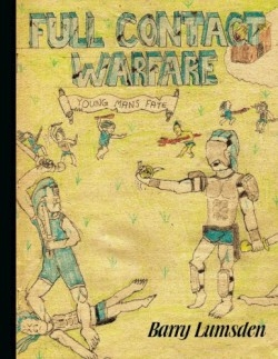
One of the biggest drawbacks of this book is its lack of an introduction or any explanation about the book’s subject matter. The first several pages are filled with crude pencil-and-crayon color illustrations. Since no illustrator is credited readers must assume that he did them himself. Beneath these sketches are rudimentary descriptions of various warriors. The layout of these pages vaguely resembles Naruto (or similar) trading cards with information including one to two sentences about the character along with his/her height eye color and choice of weapon. The various eye-colors ostensibly represent “characteristics” as they are paired with one-word descriptions that one might consider attributes. Some examples are green (strength) light blue (knowledge) white (athletic) and dark blue (ruthless).
The author certainly shows creativity and an understanding of battle. He includes several interestingly “choreographed” fight scenes. Unfortunately the approach he has chosen to showcase his talents is not particularly conducive to reading. A more standard graphic novel collaboration with a professional illustrator would likely be best. As it stands today this is a virtually unreadable and most likely unmarketable product. For such a high cover price readers will likely expect a longer more professionally packaged tome.
Reviewed by
Lawrence Kane
Disclosure: This article is not an endorsement, but a review. The publisher of this book provided free copies of the book and paid a small fee to have their book reviewed by a professional reviewer. Foreword Reviews and Clarion Reviews make no guarantee that the publisher will receive a positive review. Foreword Magazine, Inc. is disclosing this in accordance with the Federal Trade Commission’s 16 CFR, Part 255.

